
This is the third in a series of four blogs exploring our work with Hounslow Council on community resilience. It describes how our resilience clusters - predicting different aspects of resilience - are spread across London and how this changed between 2009 and 2015.
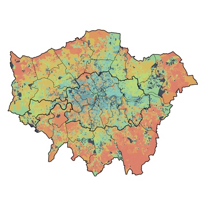
The predictive clusters can be mapped across London as well as in Hounslow - showing a shifting pattern of predictive resilence across the city between 2009 and 2015. This helps understand shifting resilience within Hounslow, as well as trends across the wider city.

In Inner London some of the weakest areas of predicted resilience in 2009 dispersed by 2015, suggesting that this part of the city is becoming more resilient. This is especially noticeable around the fringes of inner London. Over the same period a swathe of outer southwest, southeast and east London, plus the fringes of northwest London are predicted to have become more resilient. There are pockets where predicted resilience weakened, including in south London and north of the Thames in east London.

Hounslow's experience is unusual amongst far outer boroughs - although with similarities to Hillingdon and some of north London. Many outer boroughs in the south and east show strong predicted resilience.
This reveals a rather different assessment to the well documented change in the relationship between inner and outer London that emerges from deprivation statistics. A recent Smith Institute report describes "telling signs of poverty increasing and de-gentrification taking hold in some outer London areas."

Map of IMD score change 2015-2019
The differences between the mapping of predicted resilience and deprivation highlights the strengths of our resilience model and its ability to shine a new light on local areas that complements the understanding that we take from more familiar data.
Our next blog explores the relationship between what we know about population churn and international migration, and changing predictions of resilience in Hounslow.
