

In 2015, Social Life and the Social Innovation Exchange (SIX) will be launching the Cities Insight Hub. The Hub will curate and share innovative methods for understanding the social life of cities.
To help us understand the complex relationships between people and places, the Hub is looking at examples of social mapping tools and collaborative research methods. Over the next few months, we will be encouraging people to share their maps and experiences with us – more about this in the next few weeks.
This post shares three examples of maps from South Africa that offer us new insights on urban living and placemaking.
South Africa is a country with great opportunities, but ranked 63rd on the Social Progress Index, it still faces many challenges. While the first democratic election was more than two decades ago, it is still a deeply divided country on many levels. This is especially visible in the urban fabric – cities are struggling to evolve beyond the segregated urban layout of the past; they are not yet providing sufficient housing, services, or infrastructure, and unemployment rates are high.
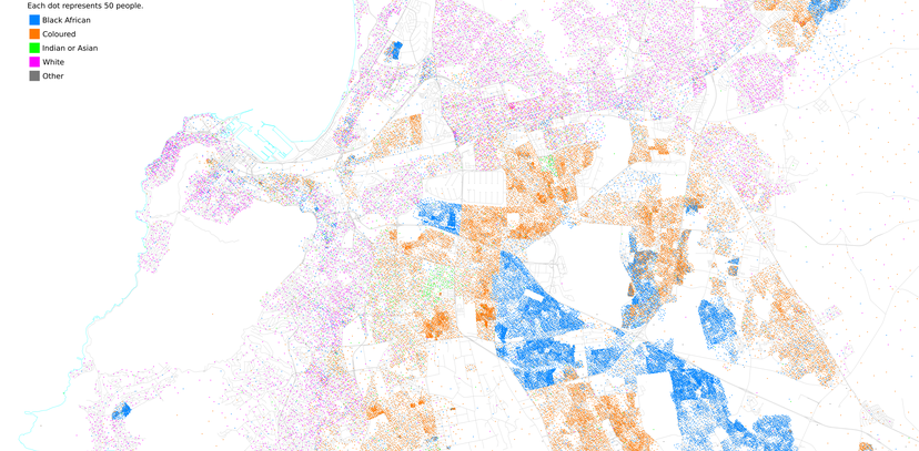
The first mapping example visualises basic census information, but in a way that highlights a lack of connectivity and integration within urban areas across the country.
Ethnic distribution in South African cities is mapped using dot distribution maps. Similar maps mapping racial distribution in Chicago made by Bill Rankin inspired Adrian Frith to make a South African version. The South African maps use data from the 2011 census.
 Image: Adrian Frith
What’s striking about these maps is not only seeing the mix of different people in different areas, but also seeing the stark variation in density across the city. On the Cape Town map, the traditionally wealthier suburbs of Cape Town closer to the CBD have a much lower density than those on the periphery in historically marginalised areas.
A lack of integration and connections is clearly present in larger areas, as seen in the previous map, but also on a much smaller local scale, as seen in the next example.
The second example overlays the location of gated communities with social isolation data for the Gauteng province, showing that some relationship between the two exists.
Gauteng is the country’s smallest but most densely populated province with the largest urban population in South Africa. This is also the province with one of the highest crime rates in the country. Some middle class and many wealthier homes in this area are situated in gated communities in the suburbs. These gated communities come in many different forms, but are highly securitised, often with road closures or fenced in complexes. While these developments may create a sense of safety for those inside, they can also do harm to inclusiveness and broader community cohesion – affecting those inside as well as on the outside.
“Gated communities by design limit freedom of movement and have become means of restricting freedom of expression.” Christina Culwick, GCRO
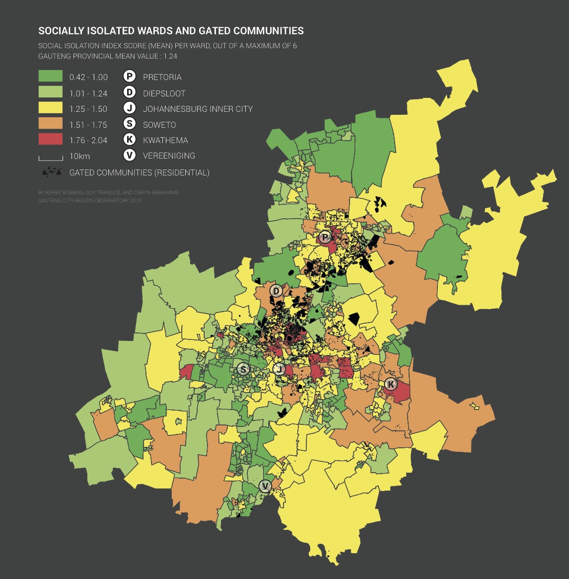 Image: GCRO
Gauteng City-Region Observatory (GCRO) does a biennial Quality of Life survey, including questions relating to social isolation. Overlaying the locations of gated communities onto a map of this survey data, a relationship becomes apparent. GCRO found that 77% of gated communities are in wards with social isolation scores above the mean.
More information on this map and the methods used can be found on the GCRO’s website.
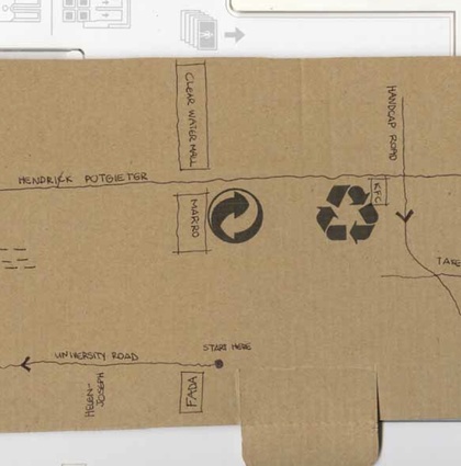
The last example shows how community mapping can be used as a tool to improve the urban environment, specifically housing. South Africa has a housing backlog of more than 2 million formal houses. Part of addressing this deficit, is the department of Human Settlement’s aim to upgrade well-located informal settlements.
The architects 26’10 South takes a participatory approach to incremental improvement of informal neighbourhoods. Together with students from a local university, in 2011 they worked on strategies for the improvement of the informal settlement Ruimsig on the outskirts of Johannesburg, also in Gauteng. Many informal settlements like Ruimsig grew organically, and are very dense areas.
Part of the work done to improve the area included detailed mapping of the existing layouts, as well as mapping suggestions for improvement. The mapping process undertaken was through active engagement and collaboration with residents to ensure the right approaches are taken to address local issues. City officials and other stakeholders were also involved throughout the process. An important part of this approach is that most of the improvement works can be done by residents and aren’t ‘delivered’ by professionals.

Image: 26'10 South
Maps produced at Ruimsig were used to ‘re-block’ the area – an approach to “reconfigure and reposition shacks in very dense informal settlements in accordance to a community-drafted spatial framework”. This helps to create safer spaces, usable communal spaces, and space for better services. This approach is being adopted in different parts of the country, with the City of Cape Town adopting a re-blocking policy in 2013 in order to increase service delivery and improve safety in informal settlements.
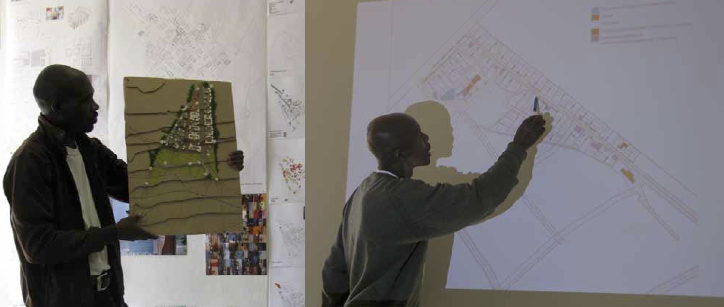 Image: 26'10 South
These three examples highlight how mapping can be used both to visualise existing data to raise awareness of the legacy of inequality, and, importantly, how maps and mapping methods can be used as participatory tools for improvement.
By Saskia Baard. Saskia is from South Africa and is a project developer at Social Life.