

This is the second in a series of five blogs exploring our work with Hounslow Council on community resilence. This describes how different aspects of resilience - our resilience clusters - are predicted to be spread across the borough and how this changed between 2009 and 2015. Our first blog explained the structure of the model and why we developed it.
Social Life's new resiience model for Hounslow is based on six resilience clusters - when mapped these predict where people with different characteristics are likley to live, giving us a picture of how local assets and vulnerabilities that support or undermine community resilience are distributed across the borough.
The 2015 data shows pockets of predicted weak and strong resilience across the borough. This is most stark in Brentford, a vulnerable area positioned between Chiswick and Osterley, both with higher predicted resilience. The west of the borough is similar to the south of Hillingdon, with weaker resilience than in most of the outskirts of London. In the centre of the borough there are some more positive zones of resilience.
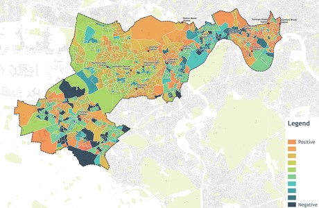
Combined predicated clusters, 2015
We explored how the resiience clusters had changed across Hounslow between 2009 and 2015. This revealed how the fragmentation of the borough increased over these years, with predictive resilience strengthening in the east, similar to neighbouring Hammersmith, Ealing and Richmond; and the west and central parts of the borough seeing less change.
The shape of the borough of Hounslow, with its narrow curvature to the east, effectively has allowed the eastern end to disconnect from the rest of the borough and become a larger part of a wider west London area where predicted resilience has strengthened. The trend is exacerbated by the disparity in financial resources between the more affluent east and less affluent west and centre.
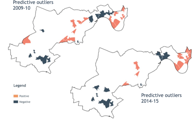
Predictive outliers show the areas of highest and lowest predicted resilience, these maps show how stronger predicted resiience has moved to the east of the borough between 2009 and 2015
Our analysis focused on the period from 2009 to 2015. 2009 was the first round of USS data that included the questions we used in our analysis, 2015 was the most recent data available to us at the time. This six year period may seem short but in it we experienced the aftermath of the financial crash and the first years of public sector austerity - both have had big impact shaping London's local communities.
Our discussions with Hounslow officers have shown us that our tool is most powerful when used at the very local level. It is a tool that provides us with both predictive and hard data to add to our understanding of an area. We found areas where predictive resilience was high, yet the actual data about the place showed a different picture - raising questions about why these areas do not fare as expected. This makes it a valuable flagging tool - highlighting patterns in data that indicate community strengths and vulnerabilities that would not appear in conventional data analysis.
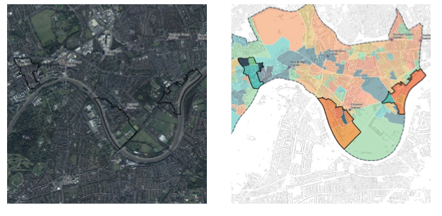
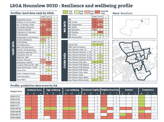
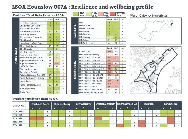
The sharp contrasts between Brentford and Chiswick stand out strongly, with strong positive and negative results positioned next to each other.
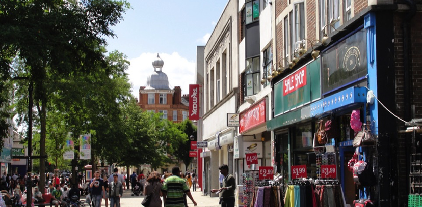
Chiswick is home to some well-established affluent communities, with an extensive range of private housing, and areas of exclusive land next to the river. Brentford however is in rapid transition with a high number of new housing developments being built in an area dominated by high-rise social housing blocks.
The detail of our data helps understand the difference between these geographically close, yet socially different areas, helping us to understand what supports may be needed to support each area through change.
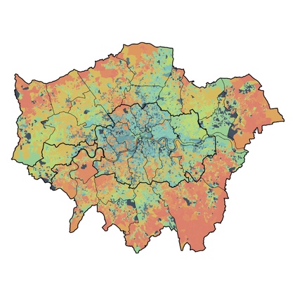
Our next blog explores the wider London picture, and how this can help contextualise our understanding of local changes.