

We have created an Atlas of Social Maps, a database of social mapping examples, tools, and methods through our Mapping the Social City project with SIX. This blog post looks at some of the divergent uses of the social maps featured in the Atlas, looking at activist maps, participatory maps, and descriptive network maps and exploring why such maps are useful.
From maps by explorers to artists, from government to private organisations, all maps are subjective. Even today with tools like Google maps, Jerry Brotton, author of A history of the World in 12 Maps, asks in an interview with The Atlantic: "My question is what gets on maps, who pays to get on maps now, and who can't pay and is therefore not on maps?". The maps in the Atlas of Social Maps aim to rebalance this, to empower local people to put themselves on the map as well as create a broader and more inclusive dialogue between decision makers and citizens.

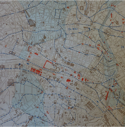
Architects Caroline Wuethrich and Geraldine Borio’s map over the 2011 Hong Kong protests
Activist maps
Within social movements maps have played an intricate part of the process of documenting. From mapping the final days of the Paris Commune in 1871 (see image top-left) to the more recent occupy movements’ camp-maps, activists have used maps to report events and protests.
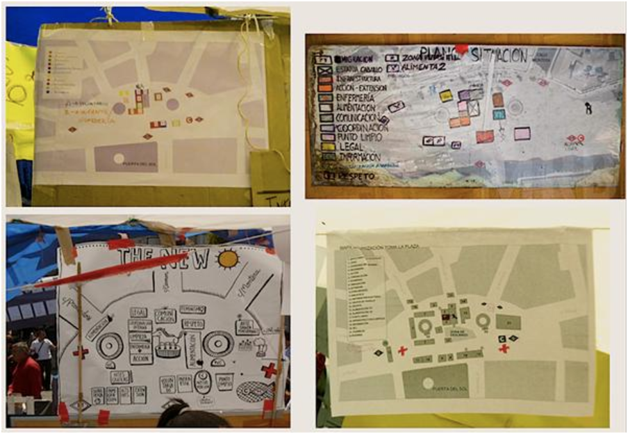
Maps from Acampadasol, Madrid 2011, montage by Julia Ramírez Blanco.
At the 2011 occupation of the Puerto del Sol square in Madrid the maps created by activists were by and large for people to find their way around the encampment. As the camp continued to develop, cartographies ware created regularly to keep up with the changes. A project at the square, Archivo 15M, sought to create an archive collecting all the material produced during the occupation. This archive continues to operate and collect material today. Within this process the maps went from being tools for way finding to becoming historical artefacts. By documenting what was taking place at the square, the activists were able to direct in which way the occupation should be remembered in history[1]. These initiatives have inspired similar mapping projects, for example at the 2011 occupation of Zuccotti Square in New York and the 2014 Hong Kong riots, where similar maps were created documenting how the occupations were organised and what took place.
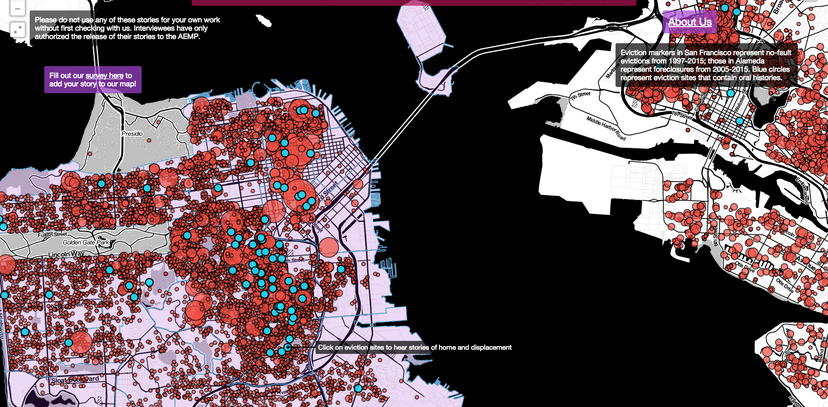
Besides cartographies of occupations as the examples above, activists and grassroot organisations have used maps to visualise changes of spatial structures and power relations such as processes of eviction, gentrification and social displacement. The Anti-Eviction Mapping Project is an example of this type of mapping, where mappers have used a variety of methods such as gathering oral narratives or using existing data like census data to create awareness and tell the stories about the dispossession of San Francisco Bay Area residents. Such maps are important both as maps that diffuse information and share data as well as being maps that spur social action and incite people to engage and understand the changes.
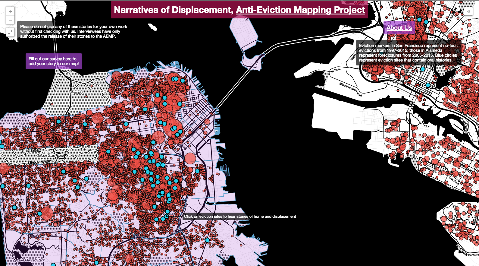
Narratives of Displacement, from the Anti-eviction mapping project
Participatory maps
Another way in which maps have been used is what can be described as "participatory maps". These are experimental mapmaking processes that look at new ways of creating maps which seek to empower local residents, and influence urban planning from below. The focus varies from reporting on every day life and local networks to influencing urban planning, but what link these maps together is the method. In these maps, data is gathered in a collaborative process between NGOs, and/or local authorities, and local residents (see examples of methods for participatory mapping in our Atlas).
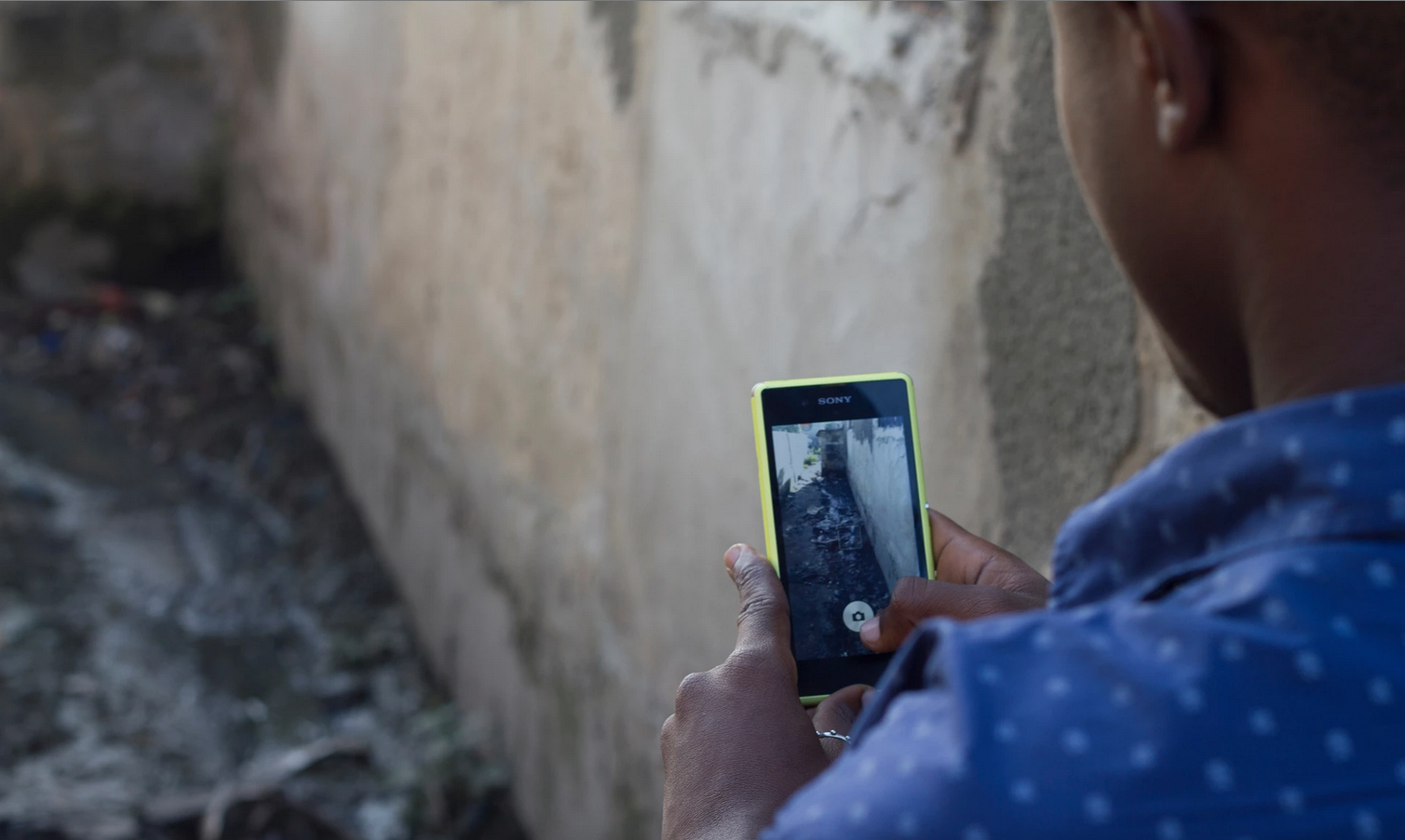
Urban planning student Robinson Kisyombe takes part in a community mapping project in Tandale, Dar es Salaam. Photograph: Mark Anderson for the Guardian
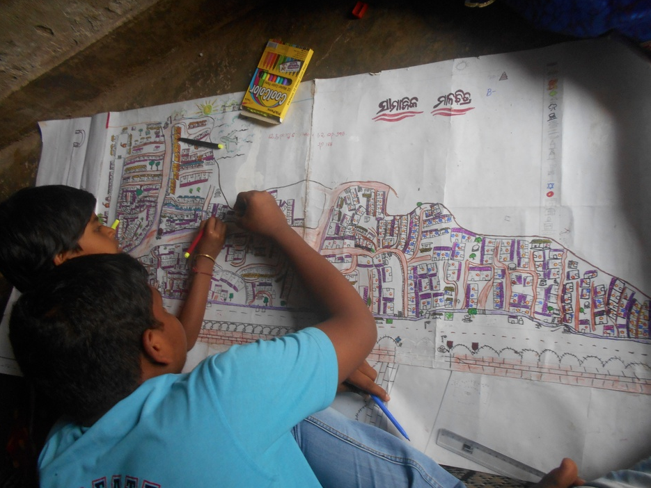
Young mapmakers sketch out the changes they would like to see in their communities. photo: Humara Bachpan
The examples in our Atlas show how these projects can vary from low-tech handdrawn maps to maps made with more advanced online techniques and mobile phone apps. Today, we almost all carry a map and mapping device in our pockets. Our smartphones allow us to navigate, but also to document. In many of the examples, we see that the smartphone has enabled more user generated content, and allows more people to participate in mapmaking.
Open source programmes such as What3Words and OpenStreetMap have been used in areas where mapping and resources are scarce. In Tanzania such programmes have meant that local residents can “get on the map” and get an address, which makes it easier for them to gain access to government services [2] In India, Humara Bachpan’s mapping project asked children to draw maps of their local area and point at what changes they would like to see. The finished products were then given to local planning officials. These maps enabled the young mappers to have an influence on urban planning in their local neighbourhood[3]. Other examples are initiatives such as MappiNa (a casestudy can be found here) and Map Kibera, where grassroot organisations have used maps to record undocumented local resources and cultural institutions to create awareness of overlooked facilities in their local area. By using accessible, low-cost methods these maps help build collective value for local neighbourhoods and allow local residents to have an influence in how their local area is perceived and a voice in planning processes.
Descriptive Network maps
In our database we have a group of more formal, descriptive maps created by local authorities, NGOs and Universities as tools to share information about the social life of an area. There was a clear contrast in both the approach used and subjects mapped by grassroots and community groups, versus those by authorities
Those made by local authorities differ from the other examples, as they are less participatory, instead visualising data and networks. These kind of maps often represent data in a more traditional way. As the data is mainly ‘hard data’ these maps tend to be more formal and less personal. They do not focus on individual everyday experiences but visualise larger scale information which can be useful to residents to understand their local areas.
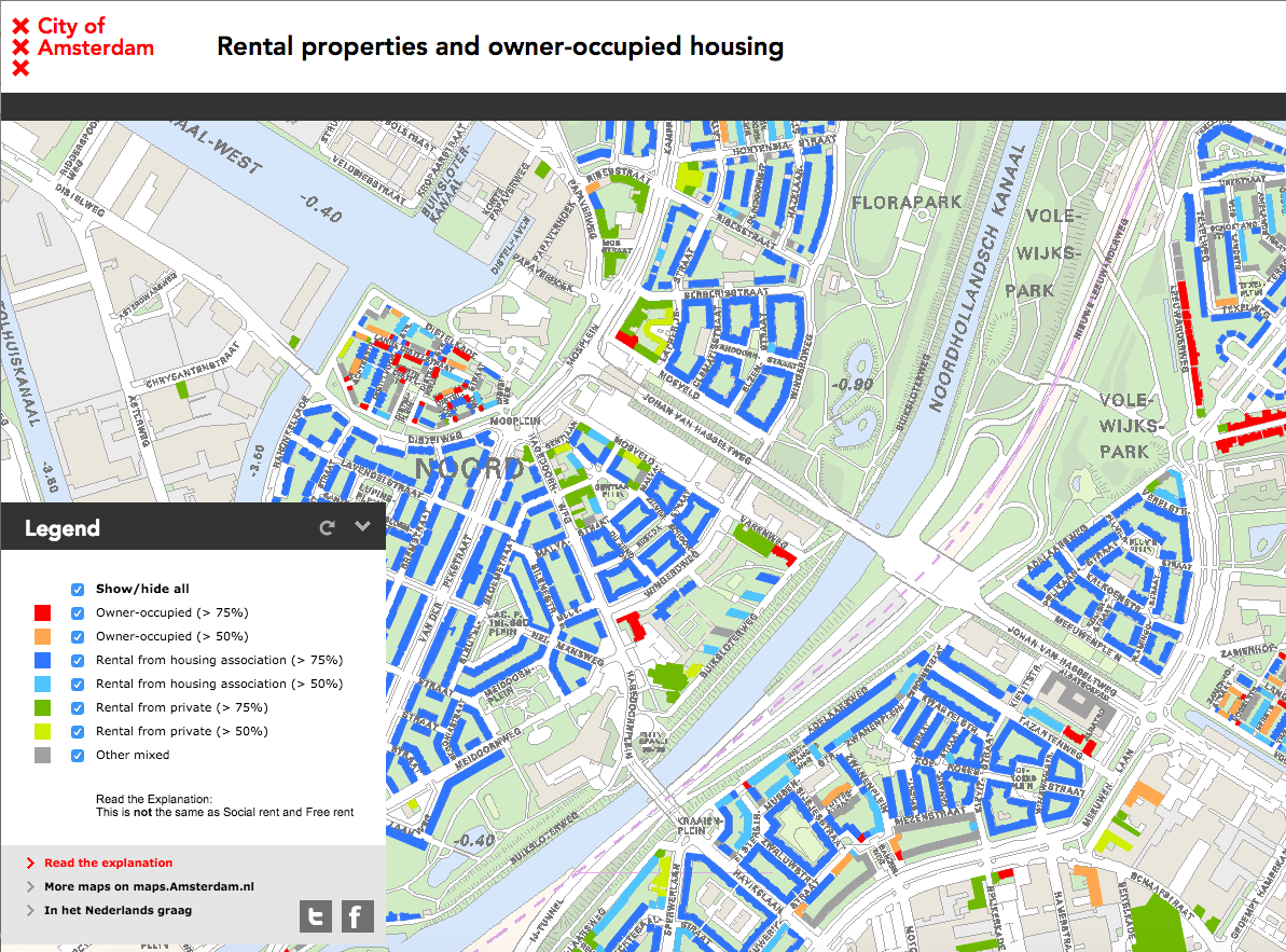
‘Rental Properties and owner-occupied housing’-map from City of Amsterdam’s interactive maps series
For example, the City of Amsterdam has created a series of interactive maps as a way to share statistical data with citizens. These maps cover a range of themes such as ‘housing and living’, ‘leisure’, ‘traffic and infrastructure’ etc. Similarly the Seoul Social Economy Centre has created a social economy map showing locations and information of social enterprises and organisations in Seoul.
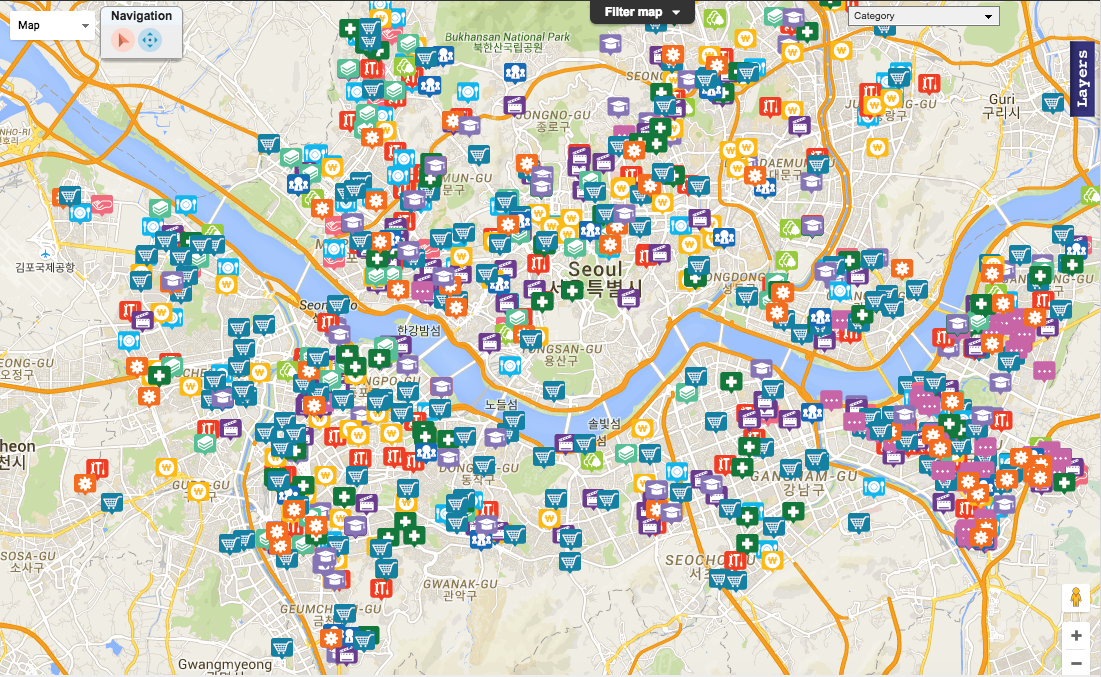
Seoul Social Economy Map, created by Seoul Social Economy Centre
The Londonmapper project analyses census data and aims to show how this data can be represented in a more comprehensible way than representing the data as numbers and tables. The visualisations aim at shedding light on the state of poverty and inequality in London and the rest of the UK.
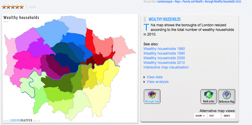
Borough wealthy households 2010, source: http://www.londonmapper.org.uk/w
In recent years there has been an increased focus on the potential of mapping. All our examples illustrate how social maps are being used as tools for data collection and sharing, residential empowerment, and raising awareness of political situations. In many cases the maps help to build a bridge between decision makers and citizens. They have democratic potential to involve more people in decision making processes and to guide authorities. They can also create an awareness and knowledge on the ground, enabling people to become more involved in discussions about space and place. With the constant growth in accessible online resources, and experiments in making maps and using different sorts of data, mapping as a medium is constantly evolving becoming able to reach more people.
This blogpost was written by Emma Nielsen and Saskia Baard.
[1] http://www.vam.ac.uk/blog/disobedient-objects/banners-and-2011-madrid-protest-camp-reading-signs-revolt
[2] http://www.theguardian.com/global-development/2015/sep/22/tanzania-smartphone-apps-africa-fastest-growing-city-dar-es-salaam-map
[3] http://www.citylab.com/tech/2015/02/kids-are-sparking-urban-planning-changes-by-mapping-their-slums/385636/